Sanju Jacob

Nature's Planner
A Mobile App Case Study
Plan your next escape into nature with Nature’s Planner!
UX/UI Designer
My Role
Figma, Miro, Adobe Illustrator, Adobe XD, Adobe Spark, Zoom, Slack
Tools
Overview
The COVID-19 pandemic has significantly changed the way we travel. People have concerns about crowded spaces, and there is a growing interest in outdoor spaces, campsites, and national parks as travel destinations.
We believe we could help people plan safe trips in a post-pandemic world by providing them with a mobile application that would allow them to reserve outdoor destinations nationwide by providing information on safety advisories and pandemic policies along with the traditional travel information.
Impact

To develop an app to help people plan safe trips in a post-pandemic world by providing them with information on safety advisories and international/domestic pandemic policies and traditional travel information, all integrated into one comprehensive mobile application.
Problem
Travellers in a post-pandemic world need an intuitive and comprehensive solution that would provide both: Crucial safety information and the planning tools offered by traditional travel apps.
Solution
Hypothesis
By providing users with more location-specific pandemic information along with traditional travel-planning tools, they could make smart decisions and travel safely in a post-pandemic world .

Methodology
Our primary focus was on answering these two questions:
-
Who are our users?
-
What are their main pain points?
We used the following methodology to tackle this project:

User Research
We began our user research by conducting five user interviews. This allowed our research team to gain insights into user behavior, thought processes, and needs.
User Interviews
Ideal Users
The ideal participants for our research would be all people who are willing and able to travel for work or leisure; although we want to limit people who are most at risk to COVID-19, we whole-heartedly encourage their feedback.

Research Goals
We set four main research objectives, to narrow down and identify the factors that influence post-pandemic travel decisions:
1. Users' travel habits (how often they travel, who they travel with, etc.)?
2. What are the users’ hesitations about traveling post pandemic (if any)?
3. Where do people want to travel post-pandemic?
Interview Research Analysis
From our online research, we discovered a recent Vrbo survey of 8,000-plus people showing that 82% of families already have travel plans for 2021, and 65% plan on traveling more than they did pre-COVID (VRBO Trend Report 2021 ).
We conducted online interviews with potential users to gain insights into the factors that influence travel-decisions and their major pain points.

We then organized the feedback into affinities that would help us make sense of all the data we had gathered through our interviews.

Persona
Based on user insights and analysis we developed our initial proto persona into our user persona, Thomas Moore.

Thomas’s Pain Points:
-
Wants help to plan an outdoor trip
-
Overwhelmed by travel apps and websites
-
Pandemic-safety info can be confusing and not location-specific

Definition & Ideation
To tease out more insights and to empathize with our user ‘Thomas Moore’ better we did a storyboard. This helped us in shaping his user journey and getting to know Thomas better.
Storyboard

User Journey

Value-Proposition
The value-proposition canvas helped us with envisioning how our newly developed product would fit in the market, i.e. how it would deliver value to users and what problems would it would solve?
Like any product in the market, a product's value lies in its ability to create gain and alleviate pain for the user.

Competitor Analysis
We did a competitor SWOT analysis to identify our competitors and evaluate their products to determine: Strengths, Weaknesses, Opportunities & Threats. We examined 3 direct and 1 indirect competitors (Direct: HIPCAMP, The Dyrt & Recreation.gov. Indirect:AllTrails).
The three main reasons for doing a SWOT analysis were to: Evaluate the major competitors in the space, examine our product standing, and consider innovations to stand out.

Ideation & Brainstorming
Finally, as our team sat down to brainstorm - we linked the persona, the user journey, and all the research findings together to develop requirements for our product. We employed the Feature Prioritization Matrix to help us prioritize features that would deliver max value to both the user and the stakeholder/business.

Our Focus: High impact/Low complexity
1. Interactive Maps
2. User reviews & ratings
3. Pandemic-safety info & ratings
Prototyping
Based on the outcome of the ideation& definition process, we decide to tackle the prioritized features. We began this process by creating a user flow:

Low Fidelity Sketches
Keeping Thomas and his paint points in mind I started the prototyping process by sketching on paper. We then did a round of preliminary user testing by importing the sketches into Figma and creating hot spots.


Mid-Fidelity Wireframes
After finalizing the sketches, I created a mid-fidelity wireframe in Figma and ran several usability tests to see if the design was accessible, intuitive, and communicated well with the users.
Here is a user flow to reserve a camping site:

Testing & Iterating
We did online one-on-one usability testing on our mid-fi prototype to get valuable feedback on our design. This helped us validate some of our design choices and pointed us to more pain points and opportunities for improvement in the app.
We assigned 3 tasks to our users to complete:
We did online one-on-one usability testing on our mid-fi prototype to get valuable feedback on our design. This helped us validate some of our design choices and pointed us to more pain points and opportunities for improvement in the app.
We assigned 3 tasks to our users to complete:
Task 1: Sign Up.
Success Rate: 80%
Task 2: Find a camping site.
Success Rate: 80%
Task 3: Reserve and make payment
Success Rate: 80%
Usability Test findings
Having collected all the usability test data, we analyzed it to gain insights into our users' pain points. We organized all the honest feedbacks we got based on the frequency of response and prioritized issues that required immediate attention. Our ultimate goal was to create a truly user-focused product.

Iterations

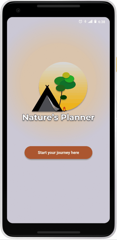
Added Call-to-Action button on splash page

Fixed alignment issues

Images of credit-cards-accepted were added
Hi-Fidelity Prototype
After analyzing the usability tests on our mid-fi wireframes and iterating them to incorporate the findings, we moved to the next step in our design process – High fidelity prototyping.
Style Guide
We started off by working on our style guide. Brown was chosen as our primary color as it signifies earth and nature. Brown color is also often associated it with stability, reliability, security, and safety.

Final Product - High Fidelity

High Fidelity Prototype in Action


Next Steps & Reflections
I learnt a lot from this project, but I wish to highlight 3 key lessons:
-
Research is very crucial to the development of any product. I wish I had more time and more flexibility with my research. The pandemic was the primary limiting factor, but remote moderated interviews and online research helped identify our app's requirements.
-
I learnt that the only way to improve an app is through repeated testing and iterations. I realized, as a designer of the app, I am biased, and there is no substitute for user testing and interviews to get the real-world perspective of users.
-
I also learnt that our intuitions often can be wrong and sometimes, just stepping back and starting over is the best way to go forward.
Thank You!
More Projects...


A Mobile App Case Study
Tune Up


Wayfair.com
An eCommerce Site Responsive Redesign & Front-end Development (Bootstrap) Case Study
Reach out to me!
Hi!
Let's work together. Feel free to say "Hi" and drop me a line. I look forward to hearing from you.
Have a blessed one!
© 2021 by Sanju Jacob. Proudly created with Wix.com